At Juillet Marketing, we know that each pixel counts in order to capture the attention of your customers. In this article, we show you the essential banner sizes for your display campaigns in 2026 - with clear and concrete tips to maximize your results.
Why are banner sizes important?
A well-sized banner ensures:
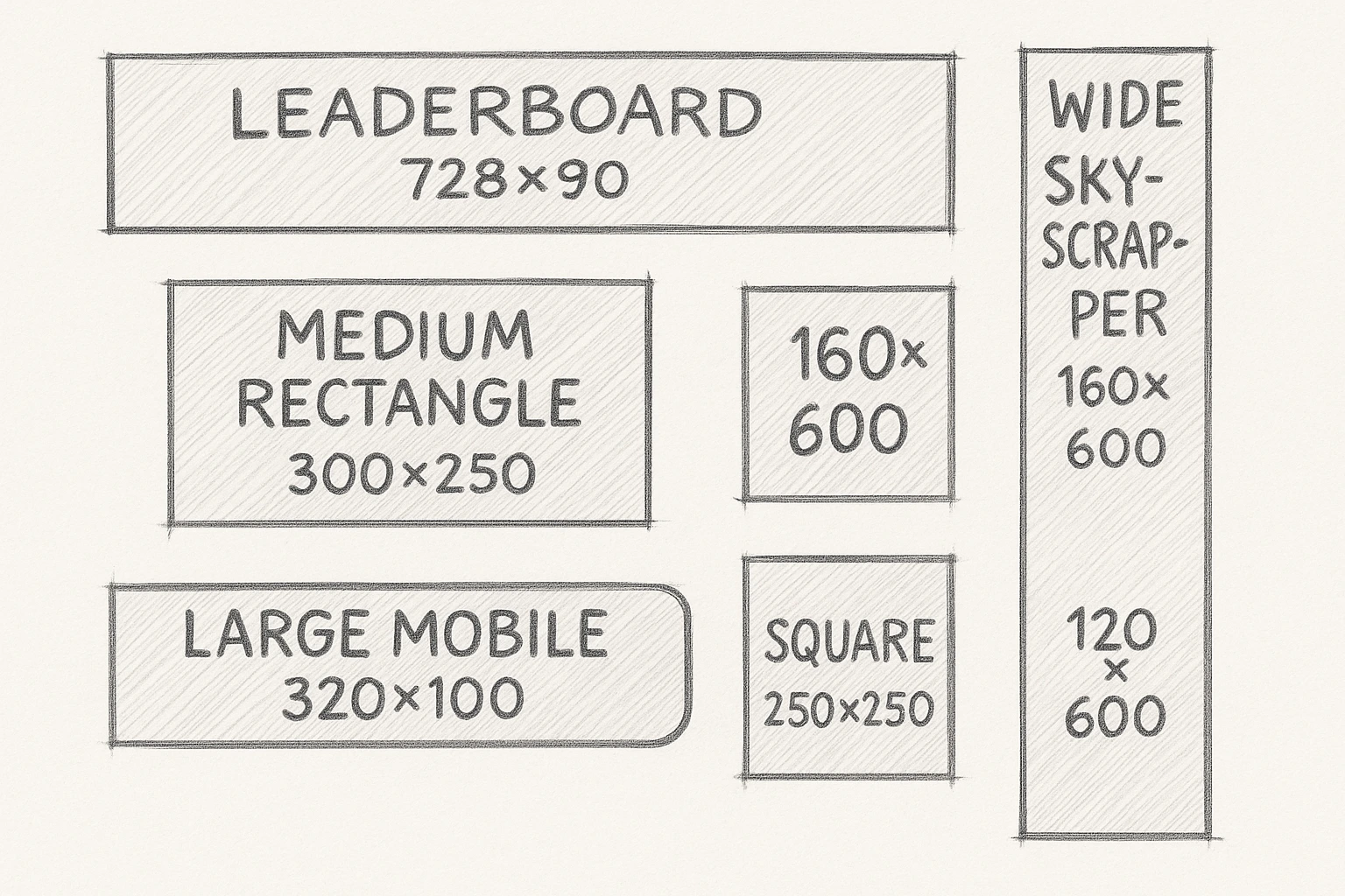
- Optimal distribution on advertising networks : Standard formats, such as Leaderboard (728x90 px) and Medium Rectangle (300x250 px), are widely supported by most advertising platforms, ensuring maximum visibility for your ads.
- A better user experience : Banners adapted to different devices improve user interaction with your content. For example, responsive banners automatically adjust to the size of the screen, offering a smooth experience on mobile and desktop.
- A better return on advertising investment : Studies show that appropriately sized banners can increase click-through rate (CTR). On average, the CTR for display ads is 0.46%.
In short: choosing the right size is non-negotiable for the effectiveness of your advertising campaigns.
Banner sizes you should know
Here are the standard formats recommended by theIAB (Interactive Advertising Bureau):
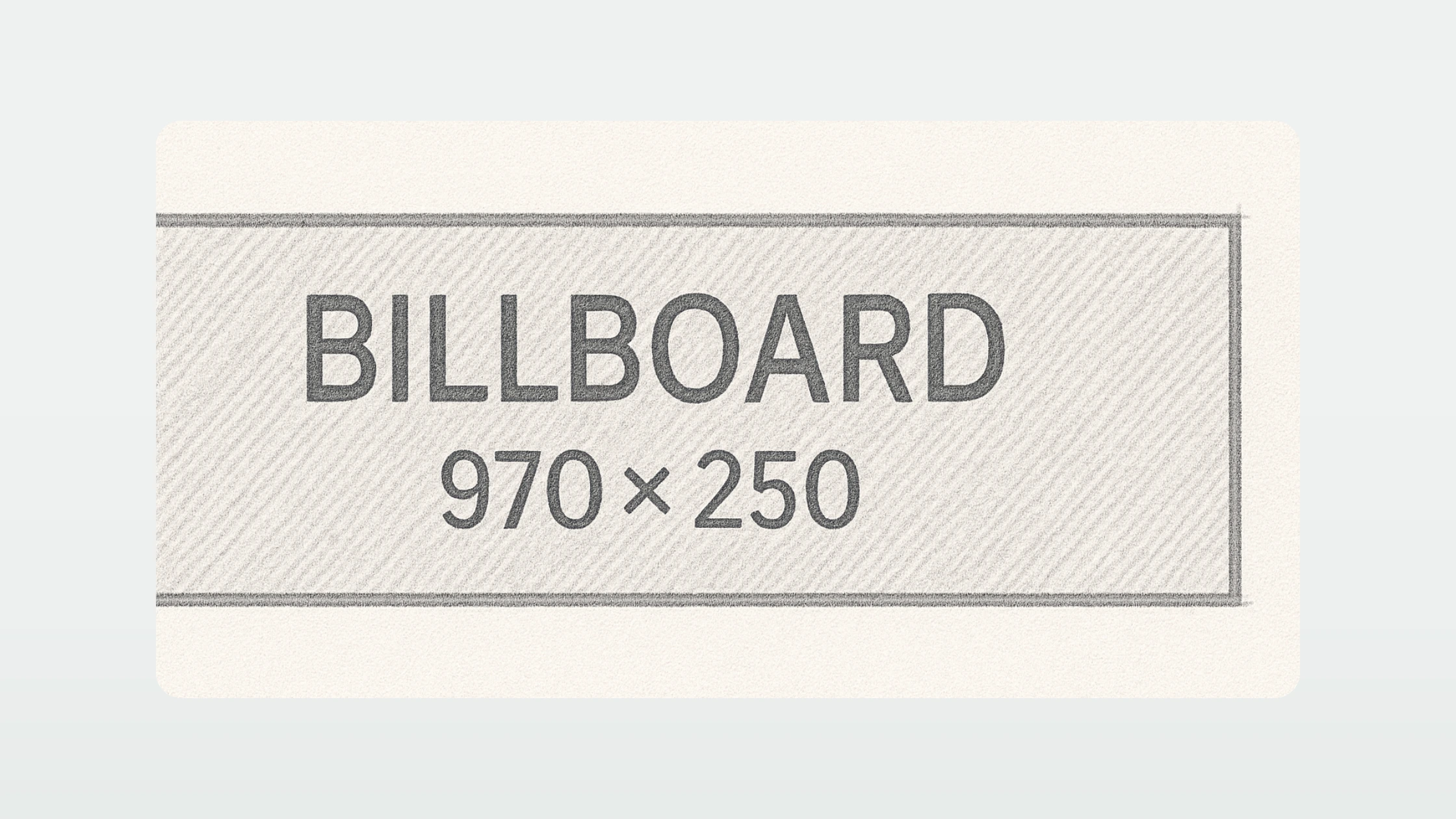
- Billboard (970 x 250 px) : impressive, very visible at the top of the page, perfect for major launches.
- Leaderboard (728 x 90 px): perfect for page headers. Great for capturing attention quickly
- Mobile Leaderboard (320x50px): designed for small screens. Great for being visible without being intrusive.
- Large Rectangle (336 x 280 px) : ideal for more visual impact in editorial content.
- Medium Rectangle (300x250px) : highly versatile, efficient on desktop and mobile. Great in contextual articles and placements.
- Half Page (300x600px) : really attracts attention thanks to its large size. Ideal for branding campaigns.
- Skyscraper (120x600px) : perfect in the side column to accompany the reading of the content.
The Billboard
Billboard (970 x 250 px) is undoubtedly one of the most powerful formats in display advertising, thanks to its size and its strategic location at the top of web pages. Its width of 970 pixels by a height of 250 pixels offers plenty of space to create a striking visual, while being fully visible as soon as the page loads, which considerably increases the chances of capturing the user's attention.
Benefits: Billboard is ideal for awareness campaigns, branding and product launches. Its size makes it possible to tell a strong visual story with immediate impact. According to Google studies, large formats like this one generate an average of 20% more memory rates than standard formats.
Where it appears: This format is often reserved for “premium” locations on media sites, news portals, or high-audience platforms. It is placed immediately above the main content, ensuring maximum exposure.
How to use it: From a design point of view, it is crucial to optimize the use of space. Choose an airy background, a powerful central graphic element (such as a product, mascot, or logo), and short text. A clear call to action, with a strong contrast to the rest of the visual, is essential. The fonts should be large and legible at first glance. Also, consider leaving “safe zone” margins to avoid that important elements are cut on certain platforms.
Mistakes to avoid: Too often, advertisers fill the space with too much information. Avoid long texts and complex visuals that dilute the core message. A Billboard should be read in under 2 seconds. Finally, make sure that the file remains light (<150KB) so as not to slow down the loading of the page.
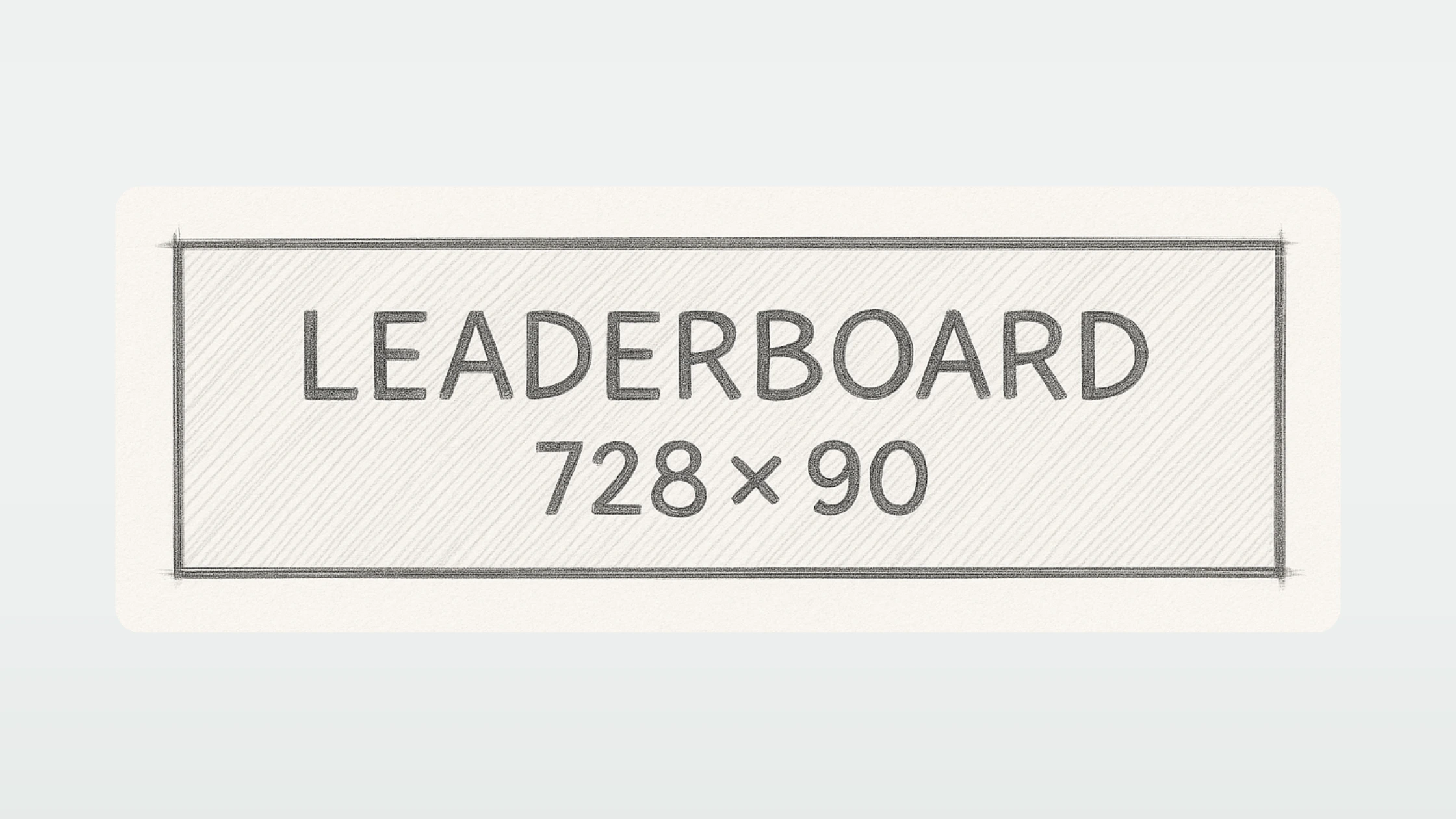
The Leaderboard
Leaderboard is one of the most classic formats on the web, widely adopted for its excellent balance between visibility and integration in the user interface. Its horizontal shape, which is quite discreet, makes it a preferred choice for brands that want to be seen without appearing intrusive.
Benefits: The Leaderboard has an excellent impression rate on the majority of display networks. A study by Wordstream indicates that the 728x90 px format is among the three most successful formats in terms of click-through rate (CTR) for display campaigns, contributing to approximately 25% of global display impressions.
Where it appears: Typically located at the top of the page, above the main content, or at the footer of the page, it captures attention naturally while browsing without interrupting the user experience.
How to use it: To get the most out of the Leaderboard, focus on a short and impactful message, to be placed at the center of the visual. Use large fonts and strong contrasts to ensure quick readability. The use of clickable and visible buttons (for example: “Learn more”, “Enjoy”) also improves efficiency. The background should be simple to highlight the call to action.
Mistakes to avoid: The main pitfall is trying to cram too much information into a relatively small space. Moreover, neglecting mobile adaptation is a common mistake. A poorly adapted Leaderboard is likely to be poorly displayed on smaller screens, reducing its impact.
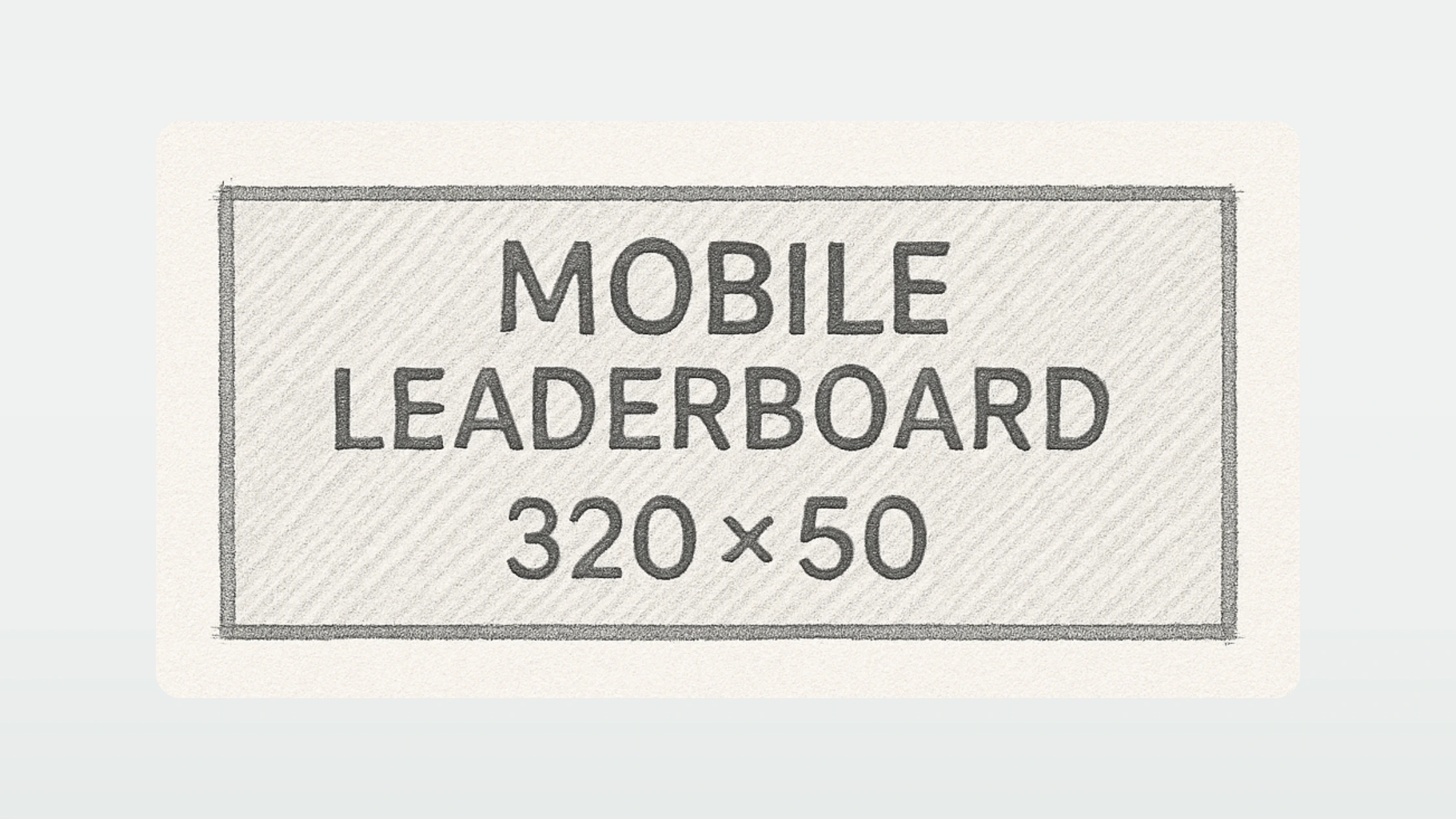
The Mobile leaderboard
The Mobile Leaderboard is a format specially designed to maximize visibility on small screens. In a context where more than 60% of Internet traffic comes from mobile devices (Statista, 2024), optimizing mobile advertising formats has become essential. This format, which is 320 pixels wide by 50 pixels high, is part of this logic of compactness and quick readability.
Benefits: The Mobile Leaderboard is perfectly adapted to modern mobile screens. Thanks to its small size but well positioned (at the top or bottom of the screen), it allows quick and direct contact with the user without disturbing navigation too much. According to a study by Smart Insights, banners placed at the top of the screen on mobile have a 35% higher visibility rate compared to formats integrated into the content.
Where it appears: This format is mainly used on mobile applications, mobile versions of websites, as well as in social and entertainment platforms. It often appears as soon as a page is loaded or during natural navigation.
How to use it: Given the limited size, the design must be ultra-clean. Use a strong image or a contrasting colored background to capture attention quickly. The text should be minimal (a few words maximum) with a large and very readable font. A call to action button is almost mandatory to encourage interaction, ideally located to the right of the visual. The use of icons can replace some words to gain clarity. Also, remember to optimize the weight of the file for ultra-fast loading.
Mistakes to avoid: Trying to “reduce” a classic desktop visual to this format is a common mistake. This format requires a design designed specifically for mobile displays: avoid small details, long texts, and closely spaced elements that would complicate tactile interaction. In addition, it is crucial to respect the guidelines of Google and Apple concerning ad formats to avoid blocking or poor distribution.

The Large rectangle
The Large Rectangle format (336x280 pixels) is an evolution of the very popular Medium Rectangle (300x250 px). Its slight increase in size allows items to be displayed more comfortably, without overwhelming the user or overloading the browsing experience. In the display world, it is renowned for generating one of the best engagement rates, especially on desktop.
Benefits: The Large Rectangle maximizes visual impact while being suitable for smooth integration into content pages. According to Google AdSense, rectangular formats like 336x280 have 15% higher click rates on average compared to longer or vertical formats. Its comfortable size allows for excellent readability and leaves enough space to combine a strong image, key message and call to action.
Where it appears: This format is mainly inserted within the content (editorial or commercial), often between two paragraphs, or in inserts on the sides of the articles. Its contextual location improves the probability of attention because it integrates naturally with reading.
How to use it: The Large Rectangle design should take advantage of its surface: opt for a clear visual hierarchy with an attractive visual, a catchy title, and a clear call to action button. Use images that blend seamlessly with the tone of the host site to increase perceived relevance. The “native-like” strategy (which imitates the content environment) can also be very effective for this format.
Mistakes to avoid: Too much wanting to do it. The classic pitfall is to use the surface to insert multiple messages or products, which creates confusion. Also, avoid overly textured or heavily patterned backgrounds that interfere with fast reading. Finally, not adapting the visual to modern retina screens can make your ad blurry or unprofessional.
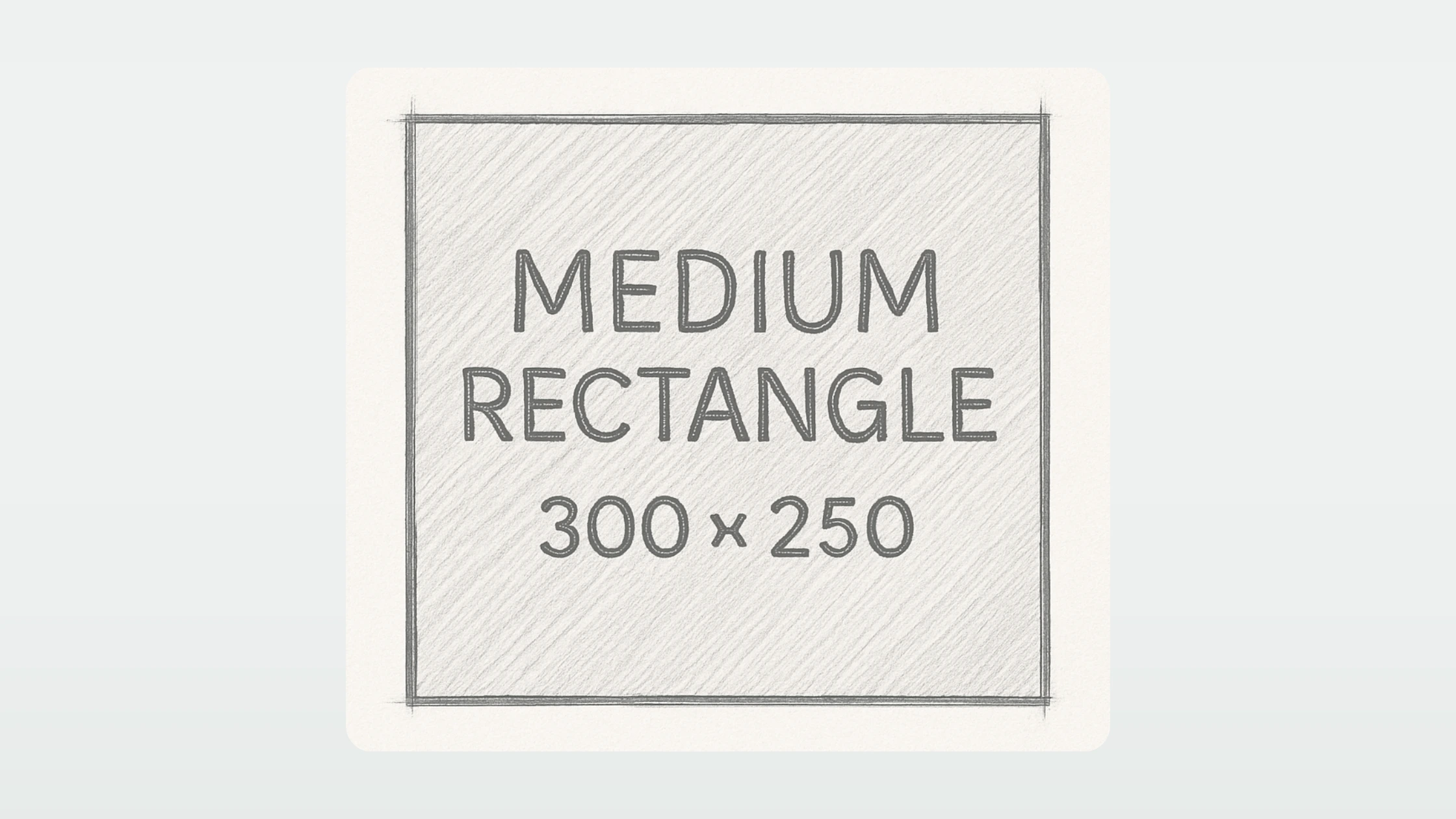
The Medium rectangle
The Medium Rectangle (300x250 pixels) is one of the most used formats on the Google Display network, and for good reason: it combines flexibility, visibility and performance. It is a compact format that offers an excellent surface-to-impact ratio, while being very adaptable to different browsing contexts, whether on desktop, mobile or tablet.
Benefits: This format is extremely versatile. According to a study conducted by Google, 300x250 is responsible for around 40% of global display impressions, making it the king format of the Display network. It can also be integrated into lateral inserts, in the middle of articles or in mobile interstitials. Its popularity guarantees excellent compatibility with the majority of advertising inventories.
Where it appears: The Medium Rectangle is omnipresent: it is often displayed in the side columns of sites, inserted into editorial content, and increasingly used in “in-feed” formats on mobile. Its ability to adapt to mobile environments makes it a preferred choice for cross-platform campaigns.
How to use it: The secret to success with this format is to focus on a strong central visual. The space constraint pushes you to get to the point: an evocative visual, a clear commercial promise, and a clearly visible action button. Using a “Z” composition (natural reading from top left to bottom right) can be very effective in guiding the eye to the call to action. The colors should be contrasting, but harmonious to avoid looking aggressive.
Mistakes to avoid: Many creatives fall into the trap of wanting to “reduce” a larger ad for this format without rethinking the composition. The result: illegible text, overloaded visuals, drowned out calls to action. Each Medium Rectangle should be thought of as a standalone mini-message. In addition, we must avoid neglecting mobile optimization: on small screens, even this format must be perfectly legible and clickable.
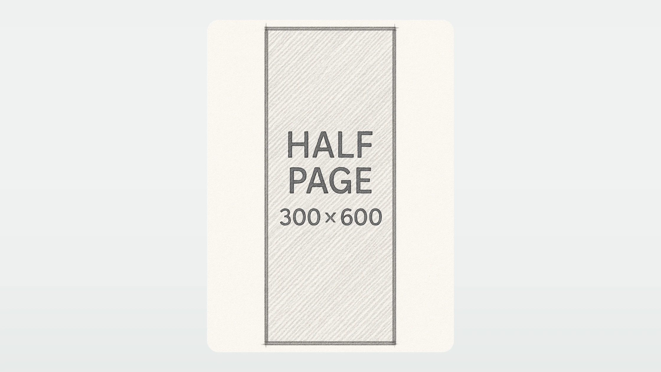
The Half Page
The Half Page format (300x600 pixels) is a true vertical advertising screen. It combines the reach of a classic display format with a visual presence close to an immersive experience. Its size offers brands a unique opportunity to tell a richer story without necessarily using rich media formats.
Benefits: According to an analysis by Google Ad Manager, Half Page generates a 28% higher engagement rate compared to traditional banners. Its large height allows attention to be captured for an extended period of time as the user scrolls through the page. In addition, it makes it possible to integrate several brand elements (logo, slogan, offer) without sacrificing readability.
Where it appears: The Half Page is mainly found in the side columns of high-audience sites, often locked in a fixed position to maximize exposure. It has a strong presence on news media, editorial sites and professional blogs.
How to use it: The Half Page is perfect for creating a vertical narrative structure. Use layered visuals that naturally guide the user from top to bottom. Divide the space into logical sections: an eye-catching visual at the top, a key argument at the center, and a clear call to action at the bottom. The key is maintaining a clear visual hierarchy, with plenty of white space to let the elements breathe. Opt for a unique message reinforced by a fluid and elegant design.
Mistakes to avoid: Resist the temptation to stack too many messages or use small, scattered elements. The user should be able to perceive the main point at a glance, even without reading the entire content. Also, avoid too low contrasts between the background and the text, especially on mobile screens.

The Skyscraper
The Skyscraper format (120x600 pixels) is a classic in vertical display advertising. Its slender shape allows it to remain visible for a long time during navigation, thus naturally accompanying the user's eyes as the page scrolls.
Benefits: Thanks to its height, the Skyscraper offers extended visibility compared to horizontal formats. A study by Integral Ad Science indicates that vertical formats like Skyscraper have an average visibility rate of 21% higher than traditional horizontal banners. This makes it a great choice for campaigns that focus on brand awareness.
Where it appears: The Skyscraper is mainly used in the side columns of websites, especially on desktop. It is often placed in “sticky” areas to accompany reading without blocking access to the main content.
How to use it: To take advantage of this format, design must exploit the vertical effect: structure information in top-down sequences. Start with an impact visual or logo at the top, then work your way down with a key message, followed by a clear call to action. Use graphic elements that reinforce the natural movement of the eye up and down, such as arrows or directional lines. Also, be sure to maintain strong graphic consistency to prevent the banner from appearing disjointed.
Mistakes to avoid: A common pitfall is filling the space too densely, which overloads the user and makes the message difficult to grasp quickly. Also, avoid fonts that are too small or important elements placed only at the bottom of the banner, as not all users will necessarily see the entire format at a glance. Finally, make sure that the file size remains optimized to avoid loading times that affect performance.
Best practices for your creative display
- Lighten your files : recommended weight < 150 kg.
- Use the format .JPG, .PNG, or.GIF : according to your needs.
- Add a clear call to action : “Discover”, “Try”, “Enjoy”.
- Simple and legible design : especially on mobile.
- Respect your brand image : colors, fonts and tone.
- Prioritize items : logo, main message, call to action.
Some useful figures
- 89% of ad impressions go through the 5 main formats (Google Display Network).
- Responsive banners generate an average of 10% to 15% more clicks.
- 70% of traffic on display networks is now mobile.
In summary
Using the right banner sizes is a simple but powerful foundation for making your campaigns perform.
Always consider the purpose, the device, and the user experience. Then test and adjust.